Related Content
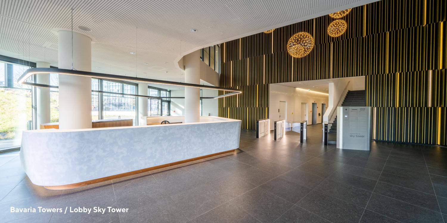
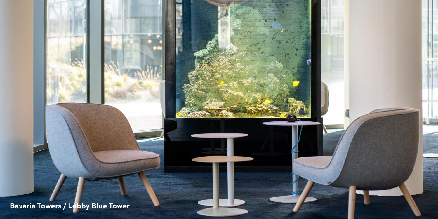
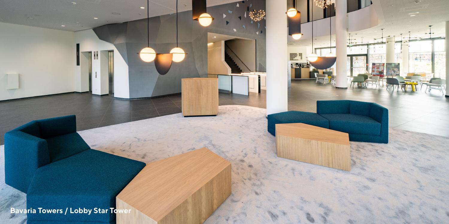
Lobbys Bavaria Towers
Publication
Designpreis für Bavaria Towers
News
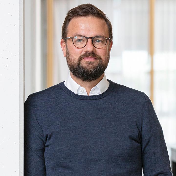
Malte Tschörtner: In our role as lead interior designers for the 3 office towers – leaving the hotel building aside – we defined three core themes or design drivers for the project: diversity, a hybrid approach and place of possibility. In terms of diversity, the main priority for us was to design various workplace options for different user groups that reflect the identity of the three towers. So, all three towers differ from one another in terms of the materials and furnishings we selected as well as in terms of the fundamental question: “Who is this for?” The second theme is a hybrid approach – in other words, we are not trying to achieve a monoculture exclusively made of desks and chairs. Instead, we want to offer users a hybrid structure that is able to meet their changing needs. With its location on the outskirts of Munich, we also needed to make sure the complex provided the infrastructure users need, so we created a unique work environment complete with a pharmacy, a bistro, a café, a supermarket and a childcare centre. The third theme is the top priority: the workplace itself. Our goal was to design the space with our interpretation of the “modern workplace”. That’s why we call it a place of possibility – creating offices that meet the needs of today’s workflows, but that are also flexible enough to respond to the unique and changing needs of each user group.
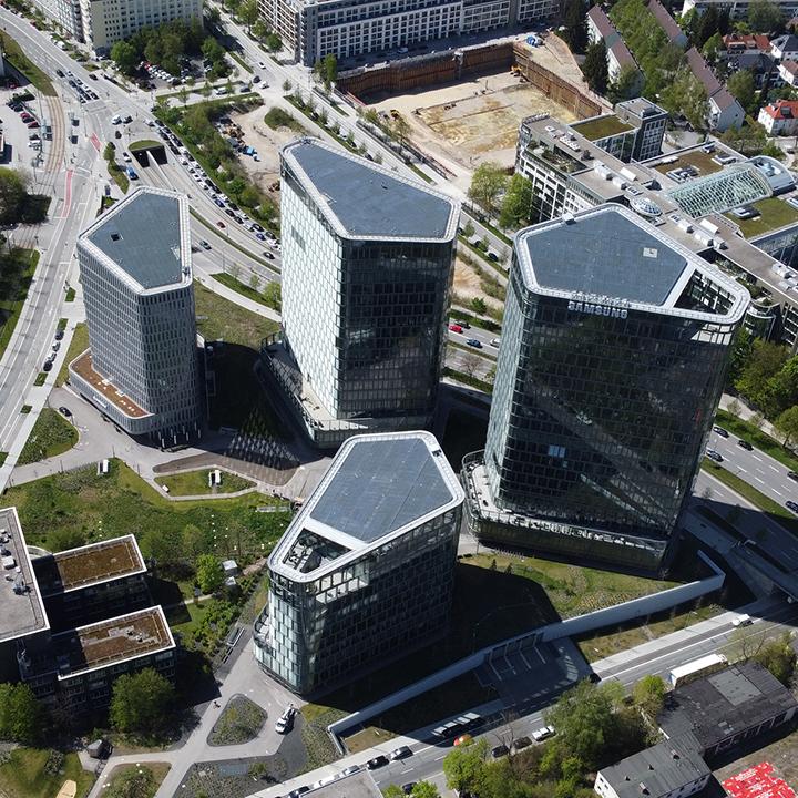
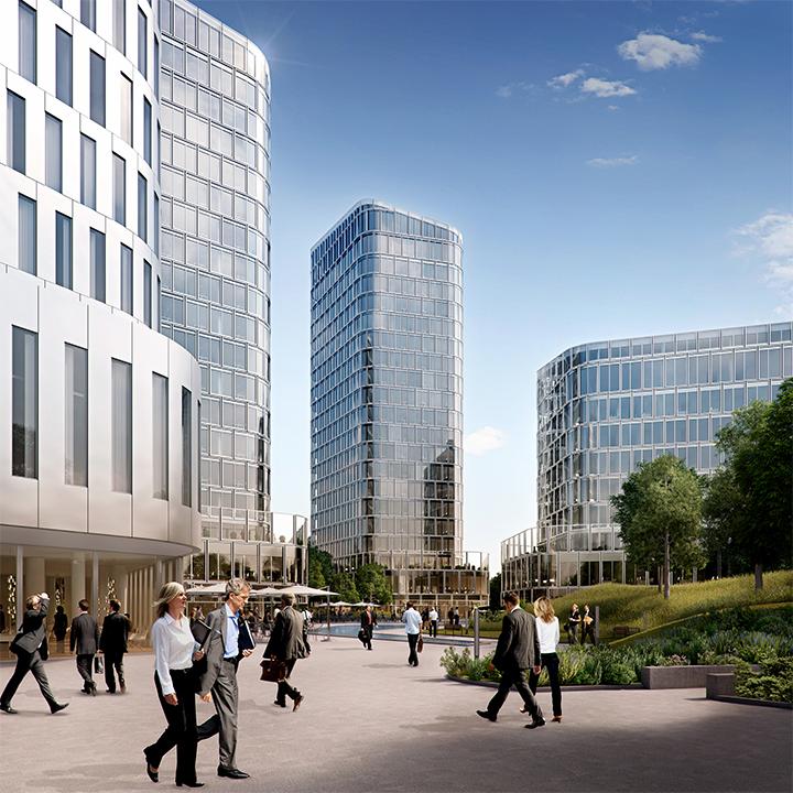
The Bayern Project Group has been working on the project for quite some time. Their Managing Director had been eying the site for at least 20 years and was eager to create something completely new for this strategic site on the outskirts of Munich. In the competition they hosted in collaboration with Munich city officials, Nieto Sobejano emerged as the winner and designed the four towers. The architects at CSMM joined the project at a pretty early stage, bringing our experience from the user perspective to the table. We focused our attention on the issue of workplace design – that was our contribution to the tower project. We asked questions such as “What width and height would be best for the various spaces within the building?” In the end, our mandate was to come up with an overarching design concept for the office interiors, the common areas and the foyers that would work well with the overall architectural design of the Bavaria Towers. The idea of approaching the project as the heart of a new urban neighbourhood with a diverse building fabric was a key driver for us from the beginning.
The biggest challenge for us was to make a valuable contribution to this competition-winning design and deliver an interior design worthy of such top-class architecture. Another difficulty was to give the design a certain uniformity within a complex conceived as an ensemble – without making it seem too arbitrary. A key thing for us was to make the occupants feel understood and to give them a truly functional space.
The ensemble character of the complex is unique and still quite novel for German high-rises. As architects, this project gave us an opportunity to create personalised workplaces for different user groups. These three target groups have an impact on the office furnishings and on the proposal defining the building specs as well as on the lobby design.
Although the towers have certain similarities, they differ in key ways including the roofline, the building footprint and the usable space. Having different building heights means different core zones in terms of the number of lifts and emergency staircases. And even though we were designing for three different target groups, we needed to find a common language for the overall design in the towers. The target group for the Star Tower are the “Stars of Tomorrow” – a younger cohort that is more comfortable with agile working and that has different workflows to, say, a law firm. Overall, our goal here was to create a co-working space where employees from different companies could start their days together. That’s why we put a coffee bar in the lobby and plan to include a pharmacy and a childcare centre. There is a conference room in the co-working space on the first floor that is available for anyone to book when they need it. And we selected materials with more sustainable, textured surfaces to appeal to these users. In the Blue Tower, the mid-rise tower, the plan was to put an aquarium in the lobby as well as a co-eating space that allows people who bring food from home to eat together. The idea here was to give people a place to relax and eat lunch without necessarily having to buy anything. We also provided communal space for daily scrums and a bistro as well as shared conference rooms on the first floor – with a bit more functionality and a different layout than the Star Tower. The Sky Tower is the executive high-rise of the complex, which is targeted to more traditional tenants like law firms. We wanted to achieve the look and feel of a luxury hotel lobby, complete with a concierge service, so we put in a fireplace, a bookshop and a high-end lunchroom run by Leonardi.
We got along famously and were really able to complement one other. The biggest challenge was in the way the project was structured. The developers opened a tendering process for the towers designed by Nieto Sobejano Arquitectos (NSA) that would allocate the construction work to two different general contractors, who would in turn be responsible for various project milestones. That meant NSA – and CSMM as well – had to relinquish some control over the process. It was important for us make sure that our core ideas and our quality standards were not lost in the contractors’ plans for the interior design and the construction – and that the finished project reflected our vision. In the end it all worked out well and ran vary smoothly.
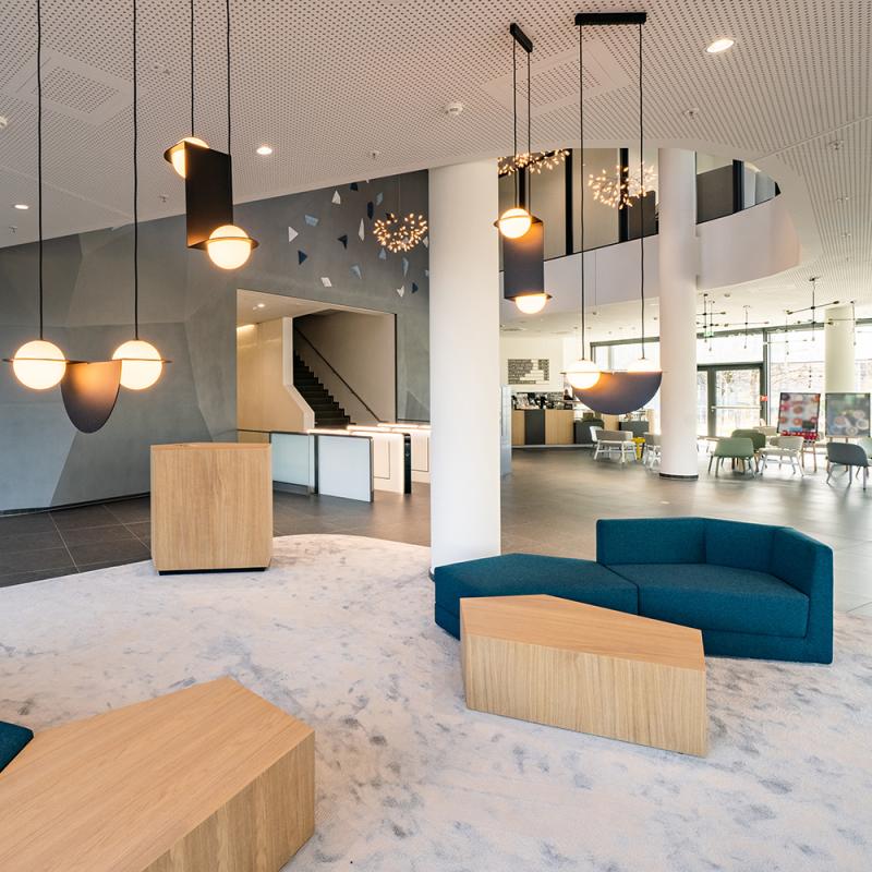
The Iconic Award 2020 was awarded for the unique concept CSMM developed for the facilities and interior design of three of the Bavaria Towers. To support a user-oriented marketing strategy, CSMM came up with a different corporate interior design for the public areas of each of the three towers. We designed the interiors to reflect the requirements of the three different workplace concepts, each with a different design language in the foyers and offices: Efficient & Modern is the motto of the Blue Tower, Young & Innovative for the Star Tower and Executive & Stylish for the Sky Tower.
4x German Design Awards 2021 for the following projects:
Even before the pandemic, workplace design was all about the interplay between focused digital tasks and in-person exchange of ideas. I think it will be even more vital to make our offices truly functional in the post-pandemic era. noch wichtiger werden. The more the home office becomes part of our everyday working lives , the more important it will be to have safe spaces where staff can meet and exchange ideas on the days the come to the office. The challenge: there must be enough room for everyone in these spaces. And they have to provide ventilation that meets current and future workplace standards. The office of the future will have to satisfy at least two additional criteria. First, we have to make our offices into places employees identify with, where they can discover and immerse themselves in the company culture. This is the best way for companies to maintain their distinct identity and retain staff. Secondly, we expect sustainability to become a decisive factor for commercial real estate – and in the minds of architects and developers. The focus will shift to retrofitting the existing building stock and improving the overall environmental impact of the industry.
